
Since Sky had launched its digital service back in 1998, very little had changed form its Sky Guide interface. Whilst numerous software upgrades were deployed that added certain features and altered the background, the menu structure and user interface remained the same thought-out. Unfortunately when the HD era rolled around, it was clear a new EPG and menu system had to be designed to accommodate the higher resolutions that HD offered.
Even though SkyHD launched in 2006,the software seen below wasn’t deployed until 2009, so existing HD boxes used a modified version of the old Sky+ guide with HD support.
Starting Up
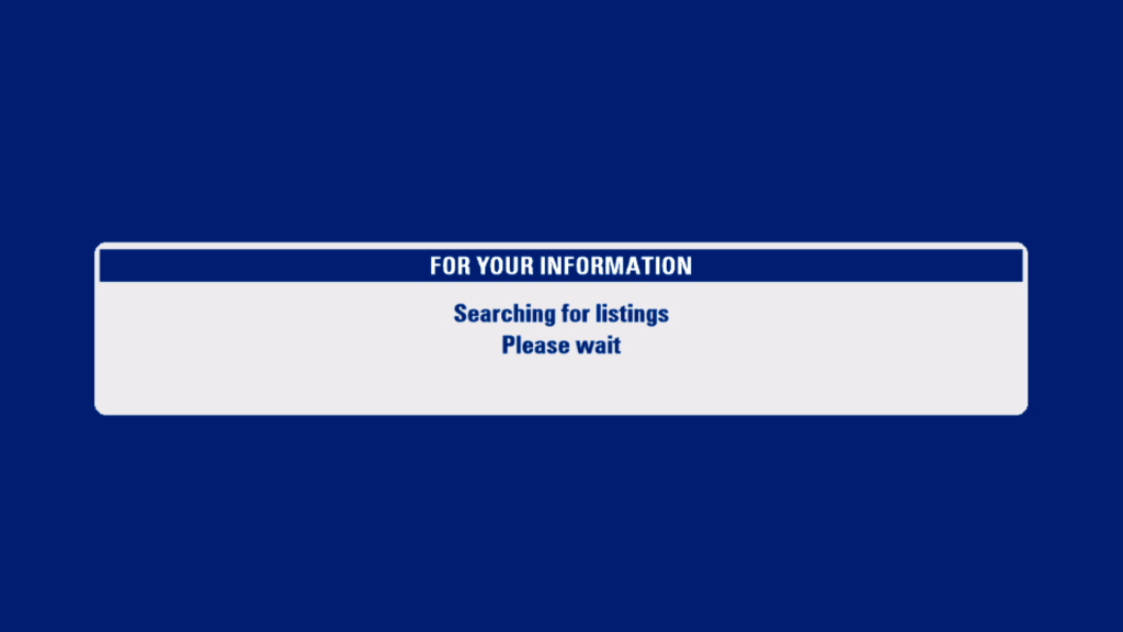
The message banners have had a new colour design, gone is the yellow and blue in favor of white and blue.
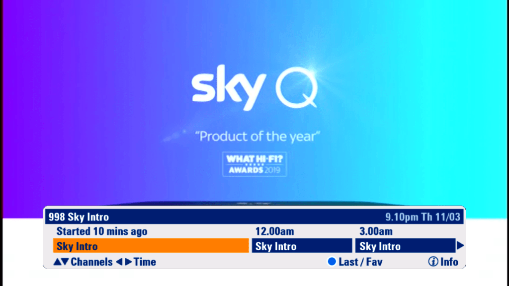
The search and scan banner has been redesigned to accommodate the extra resolution offered by HD

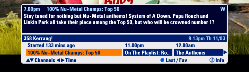
Now its possible to see what’s on now, next and later, with the option to scroll forward upto 6 hours
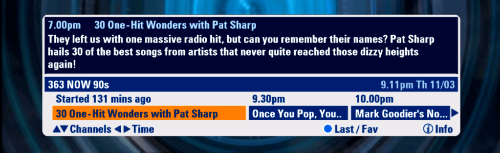
You can now view information for future programs, and programs broadcast on other channels

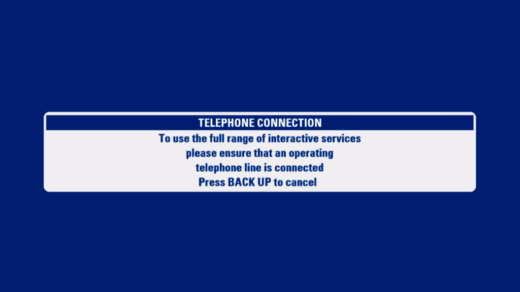
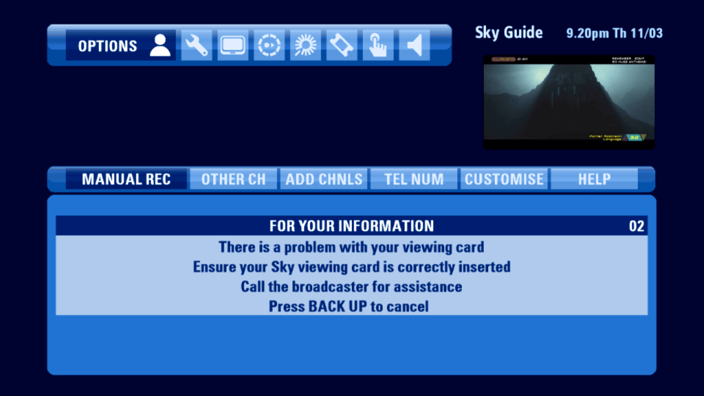
Message that appears when asked to check your viewing card

Channels that don’t offer digital text will display this message, informing the user to access analogue text via their tv remote

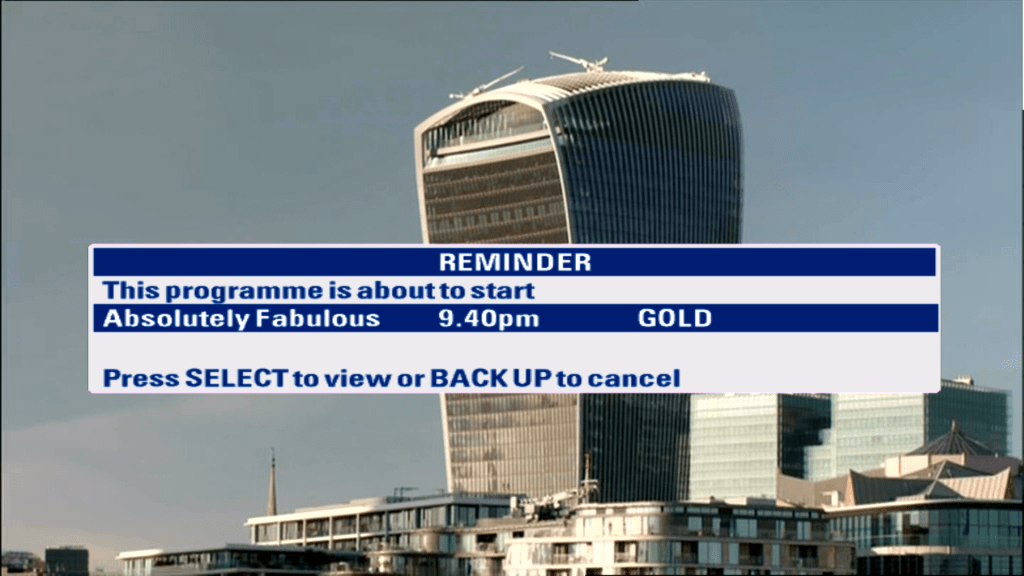
When a program is about to start thats in your persdonal planner, you will be informed via the on scrren message,
TV Guide
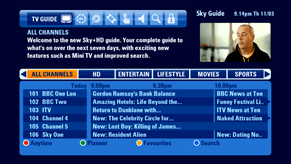
The main TV guide screen has been revamped. Gone is channel genre list, which has been replaced with a tab-like view of genres that allows for the EPG to be filtered.
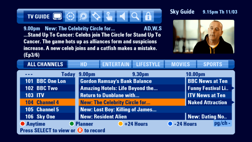
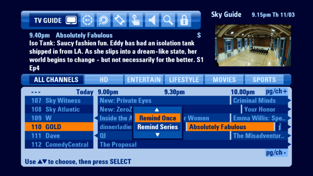
Selecting a future program gives you an option to set a reminder for this single program, or to add a series link. This differs from the older EPG, where you would add the program and would then enable the Series Link option.
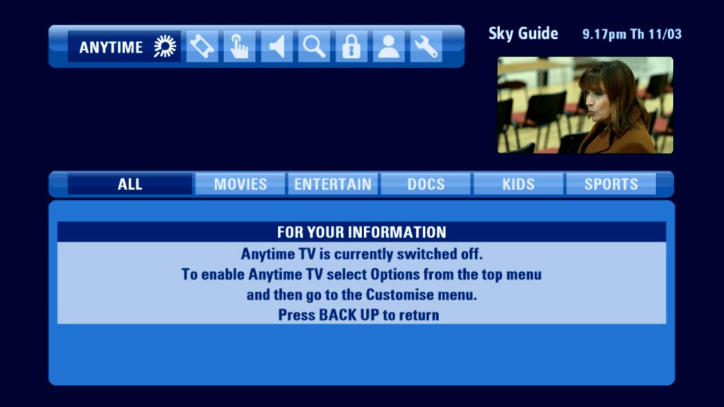
Anytime
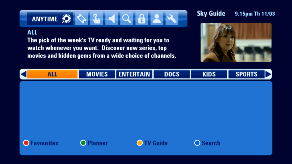
Sky’s answer to Virgin Media’s Video On Demand service, which used the reserved hard drive space of the Sky+ drive to load ‘Push’ on demand content. Despite only having 140Gb of storage
Sadly the Anytime Push service has been axed in favor of Sky On Demand, which is delivered via a broadband connection.
The best part of Anytime. Unfortunately it does not give back the reserved diskspace.
Planner

The Sky+ Planner, which shows programs that have been recorded.
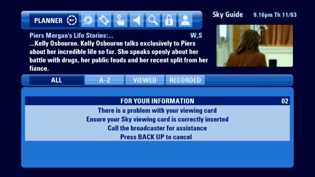
Unfortunately playing back recordings requires the use of a viewing card, which the current box is unable to read.
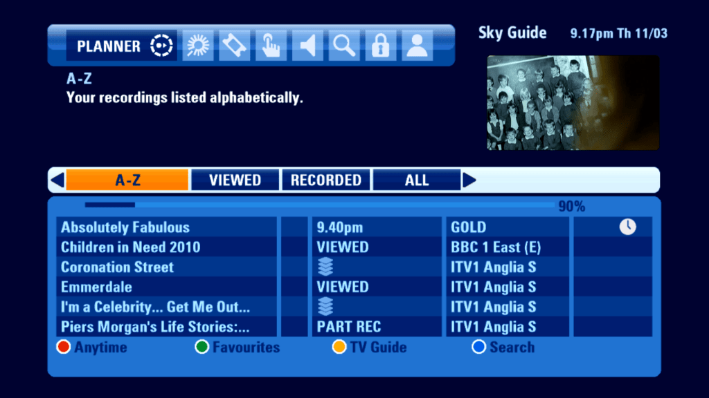
Contents of the planner can be sorted by alphabetical, or grouped by unwatched but recorder, or anything that has already been viewed.
Box Office
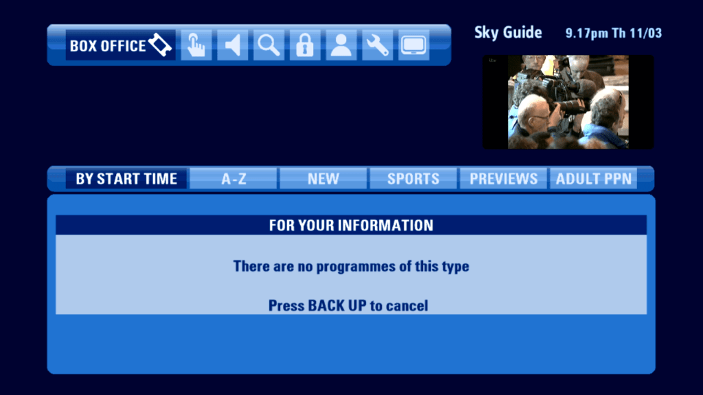
Still no sign of life for Sky Box Office, which was axed in 2016.
Interact(ive)
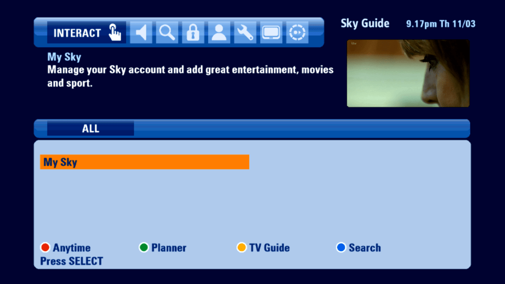
Not much to see here except for one last remaining service. Does it load?
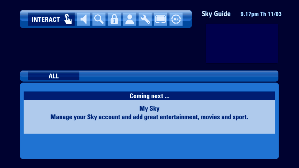
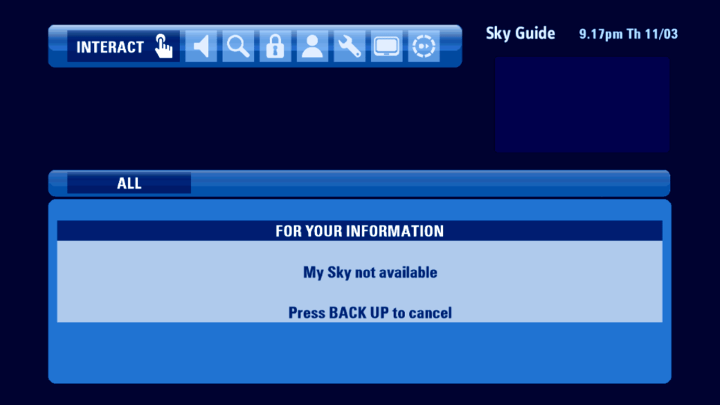
Oh well…
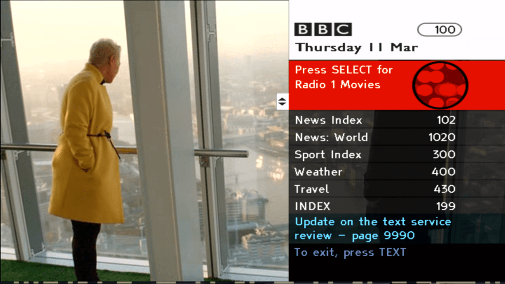
Here’s a service that does load, BBC Red Button
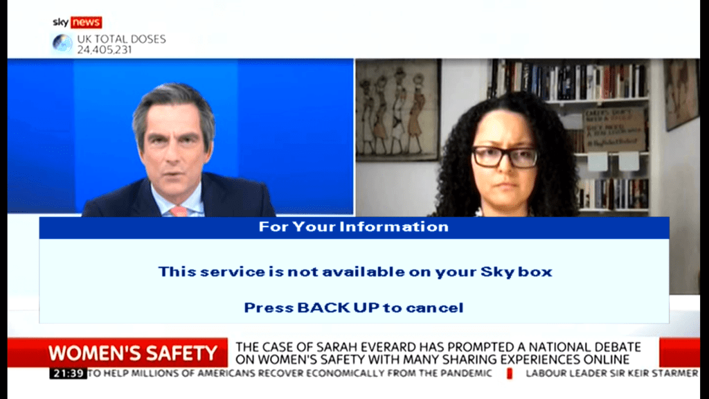
Meanwhile on Sky News…
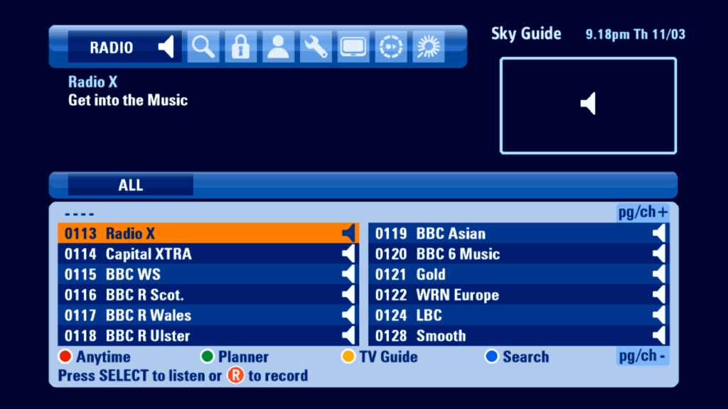
Radio
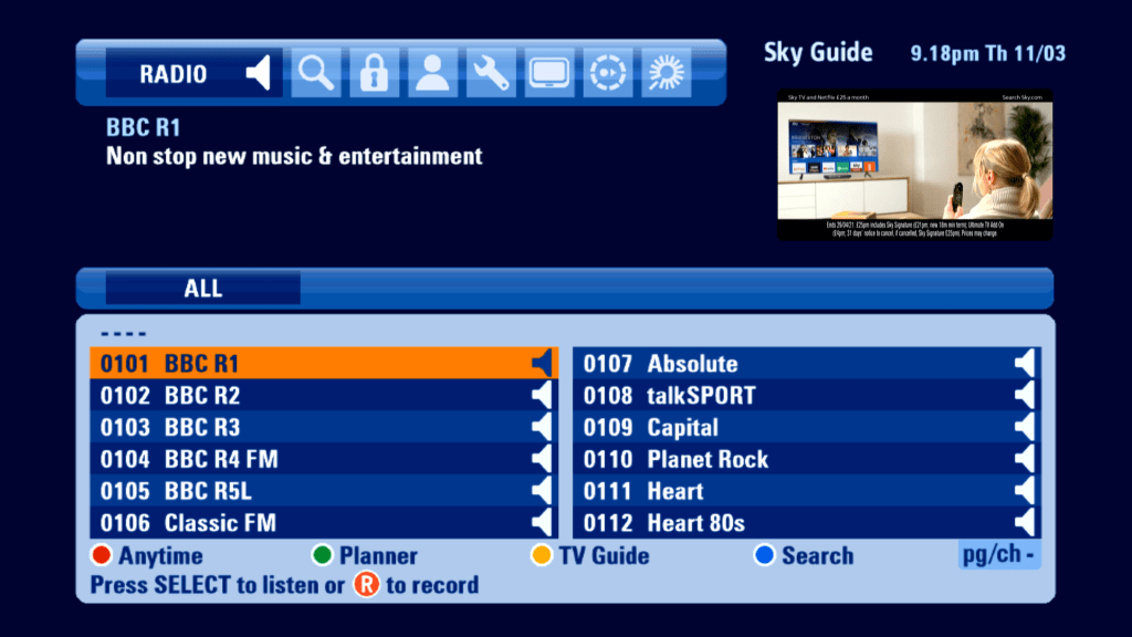
Radio channels had their owns section in this EPG, however still no genres
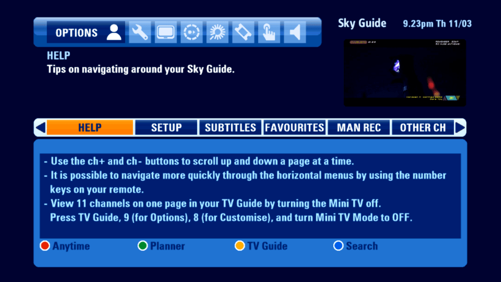
Search
Options
The Services menu from the previous Sky Guide has been split into two, Options and Settings. Probably because the EPG design does not allow for a submenu to be under another menu.
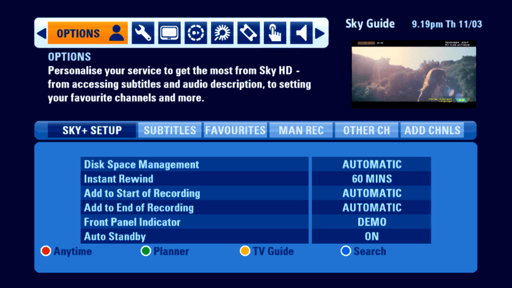
General Sky+ Settings, you can add padding to the start and end of a program
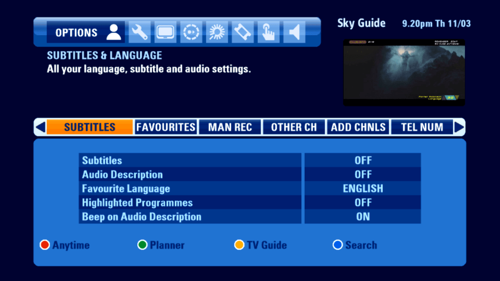
Language and subtitles, not much has changed from the previous EPG
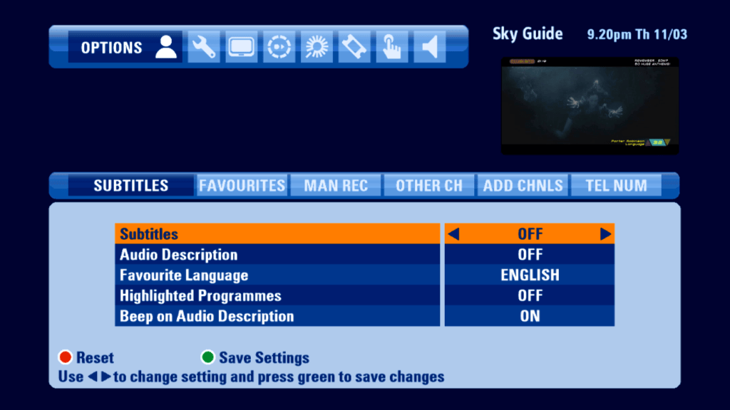
You will notice when you move the cursor down to the bottom half, the background colour changes to indicate it has been selected.
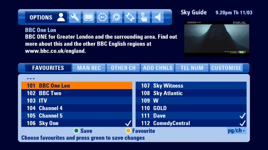
Favorite channels
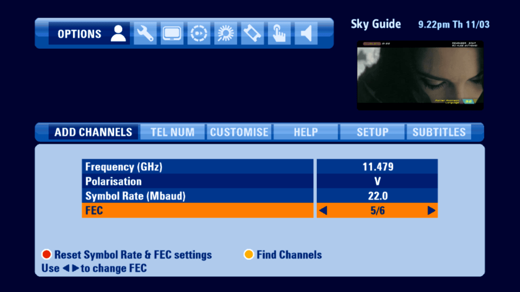
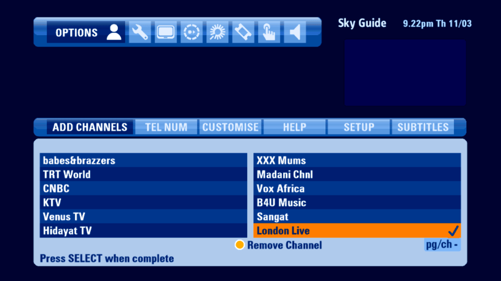
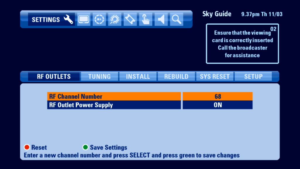
Adding channels has not changed in regards to the previous Sky Guide, you are still limited to two symbol rates

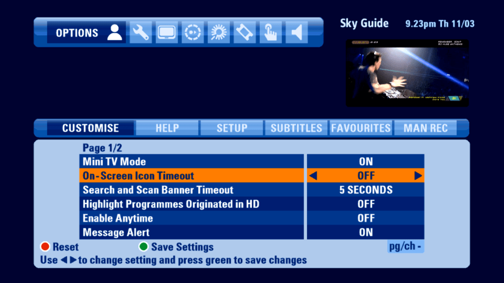
Anytime can be turned off, but does not reclaim the disk space, Mini TV can also be disabled, extending the guide interface
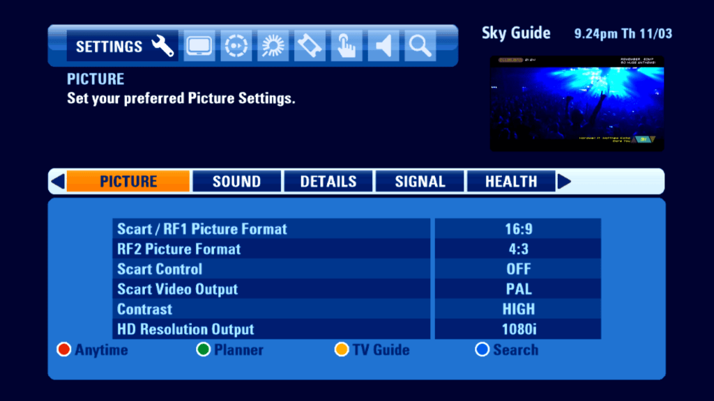
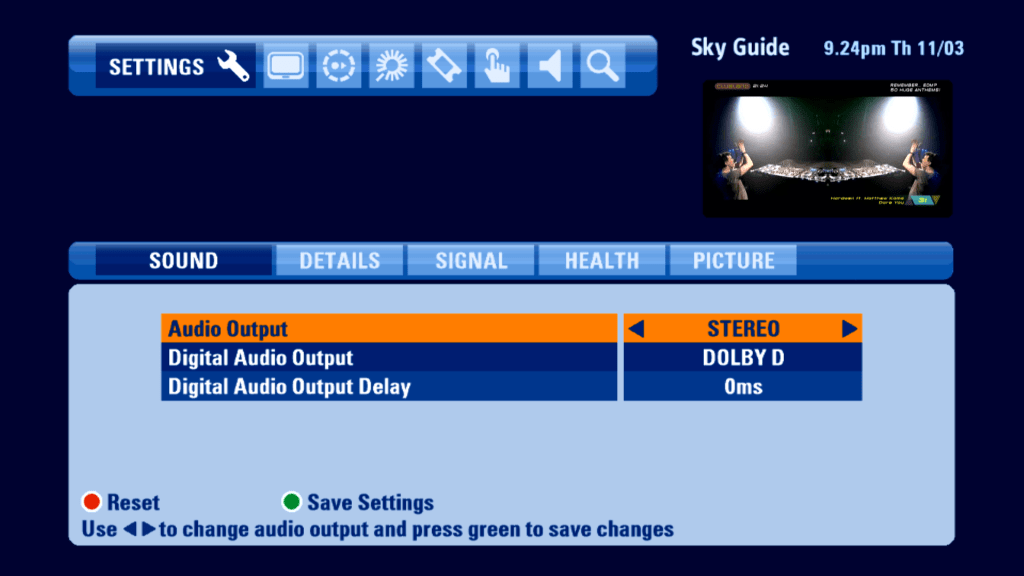
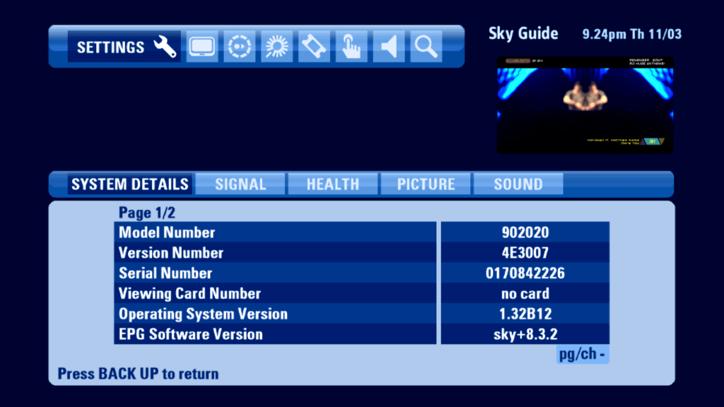
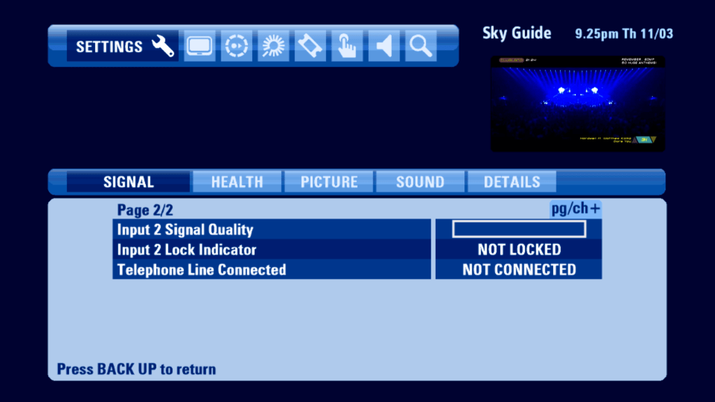
Settings
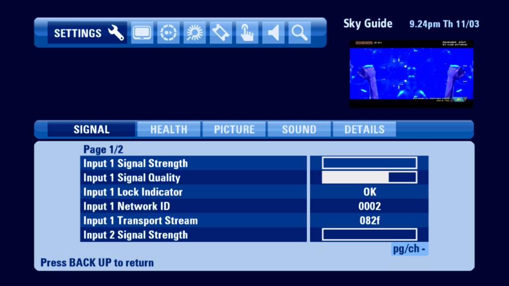
Seems to be doing a good job considering there’s no signal strength
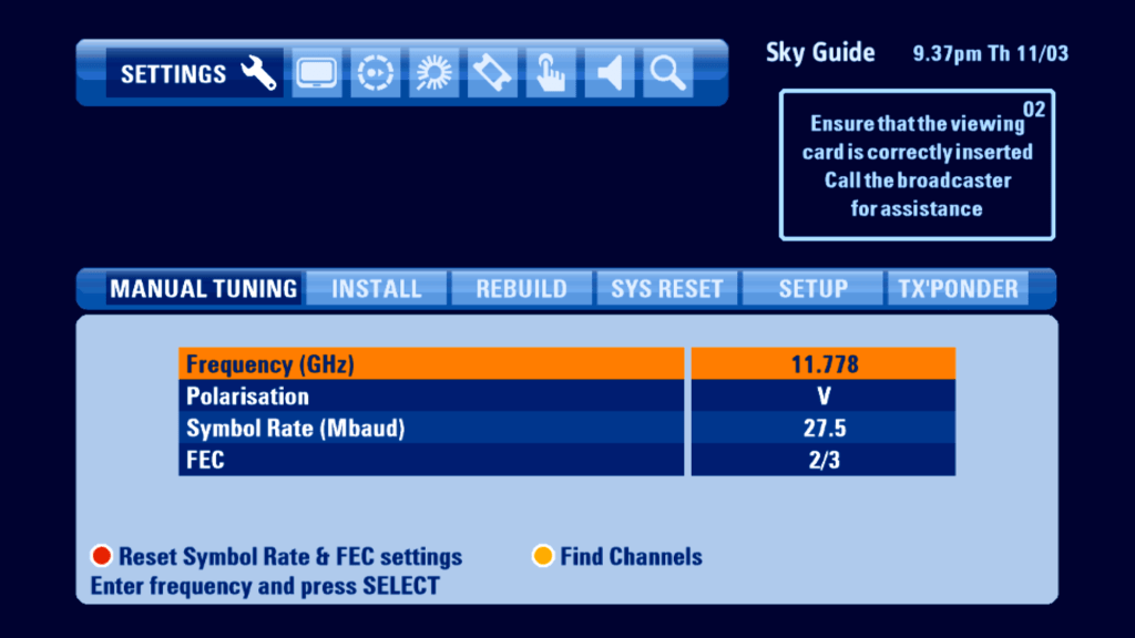
Installer Menu
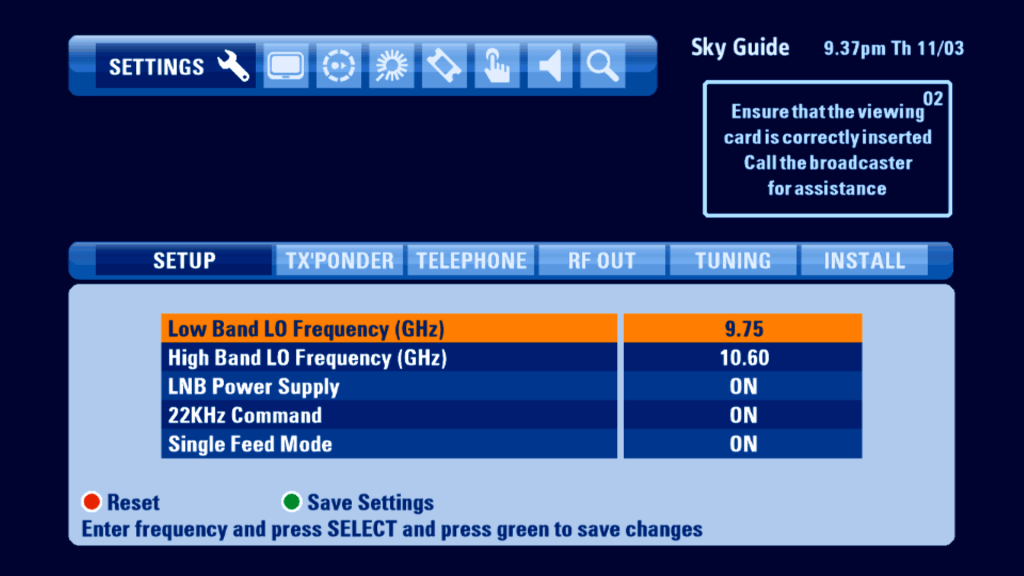
Single feed mod optimizes the HD box to work off one feed, useful if you only have one feed from a dish or multiswitch however you cannot wewatch and record one program at the same time.
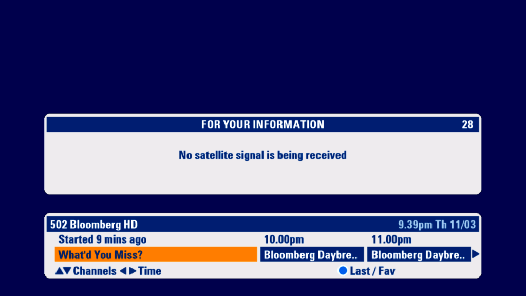
Error Messages
Conclusion
Overall its a mostly well designed EPG with a lot of much needed improvements to bring it in line with system that Virgin Media and BT offer. The introduction of the mini TV in the guide was a welcome addition,
Whilst the new software takes better advantage of the Sky HD digibox hardware, it does fall into the trap of being too cluttered, sometimes getting stuck of confused as to where you are on screen. Whilst Sky had tried hard to make the colours stand out, they are just different shades of blue, which can get repetitive. Also the tab interface could be better designed, since it looks separate to the main TV listings area, with a slight gap between the two sections.
